| Home | Notes | Github |
|---|
Written: 10-Oct-2021
This is a technical discussion1 prompted by this article on dithering. If you’ve not heard of dithering I’d recommend you read the article.
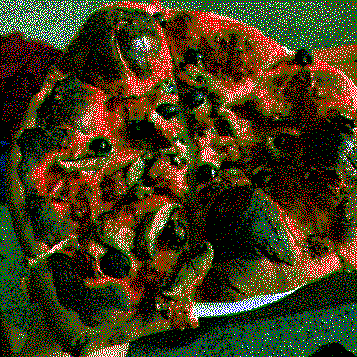
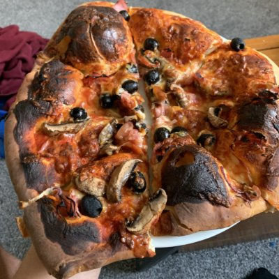
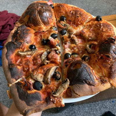
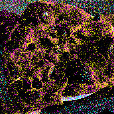
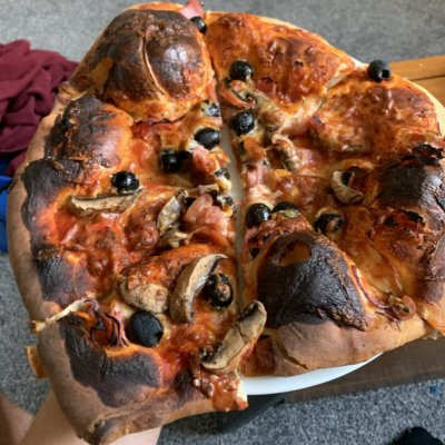
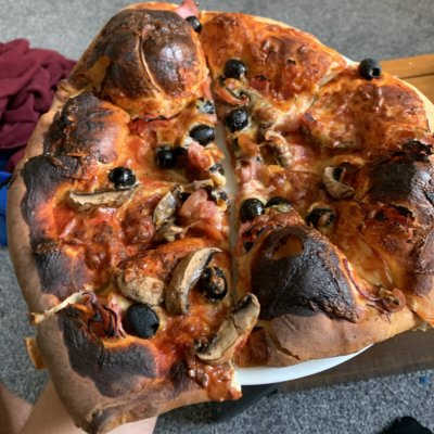
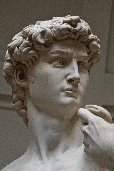
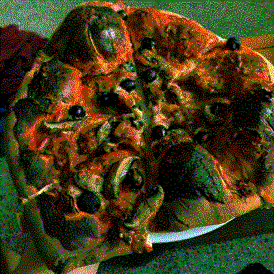
Or just look at these images2 and that’ll give you a feel for it:
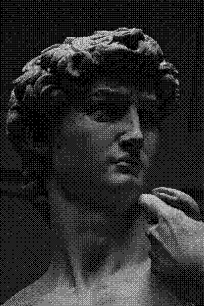
Dithering is a subject that’s caught my eye on a number of occasions. There’s something quite attractive about the effect.
Firstly I’d like to give a brief run down of the arguments presented. The logic goes:
An real example of someone using this logic to great effect would be the low tech magazine, which is excellent by the way.
Although I’ve got no problems with most of the points - I’m not going to talk about web bloat here - it’s whether dithering is the best way to go about point 4.
And I will say dithering does work. If we take a random image, and create a dithered alternative you can use smaller images. Go look at figure 1 and 2 again for reference.
JPEG was designed, by a group of experts, to maximize quality of an image whilst minimizing the digital footprint.
Although I can’t find Floyd–Steinberg’s paper on dithering and nor have I read anything much beyond the Wikipedia page, dithering doesn’t appear to be focused on compression. It’s primary practical use is for eking more performance out of limited hardware. I.e. used to improve audio quality in a limited DAC, or to imply colours that a screen cant display. The wiki page has a bunch of great examples. And although this is barking up the same tree as compression, or at least a tree in the same forest, it doesn’t directly translate into as ideal an image compression method.
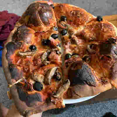
So lets look at a picture of pizza. It’s home-made, so not picture
perfect, but it should be illustrative. There’ll be plenty pictures
shown later on, so lets just talk about numbers for now. It’s taken on a
phone and stored there as a .heic. Unfortunately though
although efficient4 at storage it’s not very browser
readable. So we convert to a .png or
.jpeg.
 IMG  |Size (MB)
.heic |     1.4 ██▉
 .png |    12.0 █████████████████████████
.jpeg |     8.5 █████████████████▋
This yields terribly large images. Given the resolution of these is
terrible its good practise to crop and scale (c+s) to appropriate sizes.
In this case we go from 3024x4032 to a nice
400x400. Plenty for a little bit of web based eye candy.
The results speak for themselves.
    IMG  |Size (MB)
    .png |      12 █████████████████████████
 c+s.png |    0.35 ▋
   .jpeg |     8.5 █████████████████▋
c+s.jpeg |    0.22 ▍
But thankfully website generators are pretty well adept at scaling (cropping aside) images to size.
So all this format and scaling business is just the prelude to get to the point where we’d consider dithering. And if you take your image and dither it now, the results would disagree with the points I’m putting forward.

But there’s a trick that the .jpeg standard has up it’s
sleeve: Variable Quality. By adjusting a value - q - you
can reduce the file size at the cost of quality. Luckily for us, the
results aren’t linear, so we can loose many bits, whilst still retaining
a reasonable image of a pizza.
The table on the JPEG Wikipedia page does a better job than I could of explaining this parameter, but I’ve made a chart of some values along with a selection of dithered images.
Here’s a selection, and you can make your own mind up.
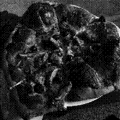
Note the patterns found with the Bayer filter. This reduces the file size, but detracts significantly from the final image.
I think these are pretty unusable, except as abstract art, so lets allow ourselves a little larger images.
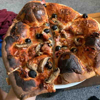
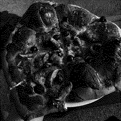
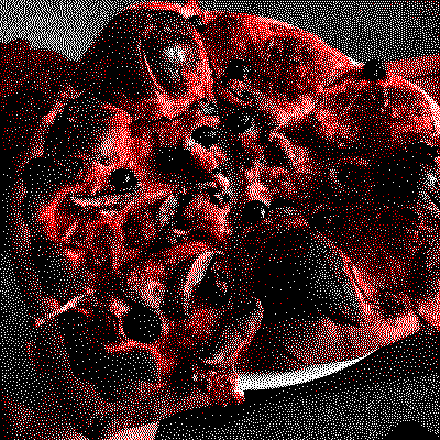
This is the clearest indication of the benefits of using
.jpg files. The image is unmistakably pizza, and its takes
another ~13.3kB (66%) more data to give a similar (but still worse in my
view) result. In the following bar chart you can see that dithered
images fall all about the spectrum of q values, wiht
varying results. I’d say that any usable dithered image take about as
much space as a q of 50, and at that point the
.jpg image is much clearer. To further solidify that I’d
look at the hole in the burnt crust in the lower middle portion of the
photos, and see if its even spot-able (let alone recognisable) in the
dithered images for what it is. There is an argument to be made that the
picture chosen isn’t the best to highlight dithering benefits5, but I’d say that’s good, because it
shows where dithering breaks down and another - more robust - method
doesn’t.
     IMG    |Size (kB)
Q=90        |    64.1 █████████████████████████
Di=rgbcmykw |    58.8 ██████████████████████▉
Q=85        |    56.1 █████████████████████▉
Di=rgbkw    |    53.2 ████████████████████▋
Q=80        |    51.0 ███████████████████▉
Di=rgbk     |    49.8 ███████████████████▍
Q=75        |    46.8 ██████████████████▎
Di=keew**   |    45.0 █████████████████▌
Q=70        |    42.4 ████████████████▌
Di=rykw     |    38.9 ███████████████▏
Di=cmykw    |    38.4 ██████████████▉
Di=cmyk     |    37.8 ██████████████▋
Q=65        |    35.6 █████████████▉
Di=rkw      |    35.1 █████████████▋
Q=60        |    33.9 █████████████▏
Q=55        |    32.4 ████████████▋
Q=50        |    31.2 ████████████▏
Di=rgbkw*   |    27.9 ██████████▉
Di=kw       |    21.8 ████████▌
Q=25        |    19.9 ███████▊
Di=kw*      |    12.6 ████▉
Q=10        |    10.7 ████▏
Where Q= is the size of .jpg images of said
q values and Di= is dithered images with a
given colour palette.r=red,g=green,
b=blue, c=cyan, m=magenta,
y=yellow, k=black, e=grey and
w=white. Thecolour palette has a noticeable impact on size,
and in my opinion understanding of the image.
Links to all the images are in the appendix
* These are done with Bayer filters, producing notably worse results. The rest are done with Floyd Steinberg Error diffusion. These are different ways of working out where to put the dots to produce the dithering effect. Play around with this online dithering tool to get a feel for it, but it’s beyond the scope of this post.
** This has two shades of grey, basically giving 4 greyscale options.
However, I’ll show some more dithered images for fun…
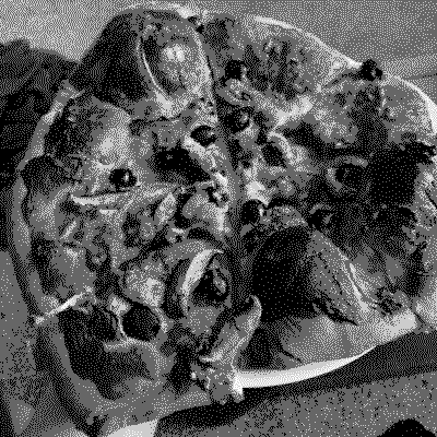
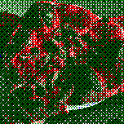
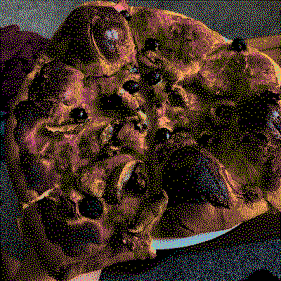
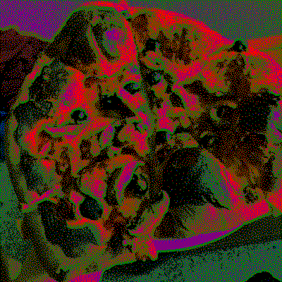
The beauty of the q value is it’s simplicity. It’s
boiled down all the complexity into one number that you can change and a
machine can interpret. For this website for instance, in my config file
there’s a line I change, and all the auto-scaled imaged also have their
quality shifted, which is great for file sizes.
There are shortcomings, like not converting .png files
to .jpg for adjustment, but for some things - like small
screenshots - I wouldn’t want that, so it’s an understandable design
choice.
I’ve also looked into other methods, like minimising the colour
palette of .pngs, which on an old version of this site
saved me several MB on a single image from some fluid simulation. But
all of this takes tuning for each image - like dithering does - for best
results. An example would be the best dithered image - in terms of size
and recognisability - would be the one with the red, yellow, black and
white colour pallet which was found through trial, error and
guesswork:
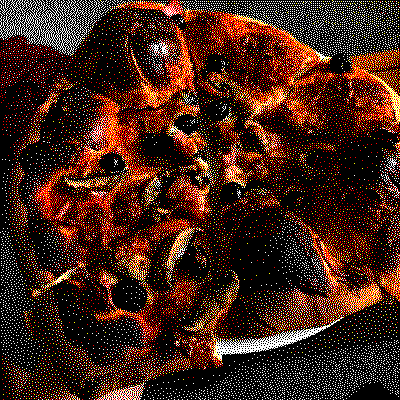
For this specific case the trade-off of using colour is so
important because the shape is somewhat alien, and that’s the point.
Individual tuning means more effort, and more effort means (most) people
won’t do it. So that’s part of the beauty of the simplicity of the
q value.
Dithering isn’t the best compression method for images, but I will admit there’s a charm to it, and an aesthetic that is - in my humble opinion - much more attractive than highly compressed jpeg images. There is a danger in how they get used: virtue signalling. The question is are you trying to save bandwidth, or do you want to look like you are? Because we’ve seen low quality JPEGs for years they aren’t interesting, and belay a old-but-not-vintage feel to a site, whereas a dithered image is something novel and stands out.
I’d argue that places like the low tech magazine use them genuinely and fits in well with their aesthetic, but for equivalent results in visual fidelity I’d say the low cost of of colour makes the JPEG superior in conveying information.
Alas, as mentioned at the start, images often aren’t required to convey information but act like a pause for readers, and a nice pattern can do the trick. Furthermore, dithered images can be basically the same size as low quality JPEGs, and both are much better than scaled PNGs on your website.
Unsurprisingly then the conclusion is more nuanced than the title conveys.
In exploring this topic I found some interesting sites, give them a gander if you’re interested: - Dither me this - an online dithering tool. - Didder - an excellent command line tool for dithering images locally. - HTTP Archive - page weight tracker. Just an interesting website to explore. - Low Tech Mag Github - Provides some more technical info on how the low tech magazine works.